In Conversation with Sharon Johnston
Courtesy of Takudzwa Tapfuma
Sharon Johnston, F.A.I.A., is a founding partner of Johnston Marklee & Associates. She is Professor in Practice at the Harvard Graduate School of Design; has taught at Princeton University and the University of California, Los Angeles; and has held the Cullinan Chair at Rice University and the Frank Gehry International Chair at the University of Toronto.
LAUREN PHILLIPS: One of the beautiful aspects of the Menil Drawing Institute is the way it embraces its subtle deviations from geometric “perfection,” in a way that speaks to both its materiality and construction.
SHARON JOHNSTON: Thank you. Peter Rice, who was the engineer for the Menil Collection building, writes about (and executes in his work) imperfection as something that brings humanity to a building. And we feel that one of the things we are happy about within the project, the thing that really animates it and reveals some of these qualities, is light. The building is dynamic through light. In certain light conditions it feels very flat. In other cases, light reveals some of the ribbing infrastructure. That it isn't a static situation is something of beauty to us, and something we think is also relevant to the content of this building.
What was the design process? Was there a single idea that generated the project?
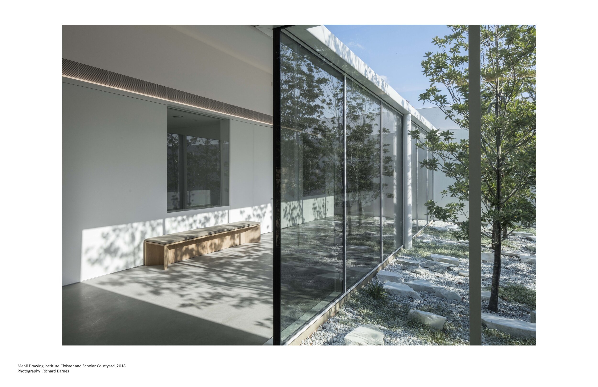
I don't think any great building comes from absolutely one idea. We often work by following different tracks that may not be aligned at the beginning. Looking at the de Menil house, looking at Renzo’s building, studying the history of this family and this foundation were all important aspects of the project. Given that the Menil Drawing Institute is a relatively small institutional building, we thought a lot about scale. When we considered the whole campus relative to this smaller museum building, we thought about how we could create a kind of sequence of arrival that would transition experientially from 30 acres of the whole campus to this single building. That was first how the garden courtyard came about, as a kind of room within the landscape of the campus. And then a serendipitous thing happened when they tore down the old apartment building, one of the parking courtyards was in the zone of the Drawing Institute and there happened to be a couple of trees in this area. We started making rooms, garden rooms, that framed these landscapes. What then became important was that the courtyards, the roofs, and the trees did a lot of the work for us in terms of modulating light. We were working along all these tracks, and then they began dovetailing together.
So the idea of the Drawing Institute as being a building somewhere between the scale of a house and a museum, the importance of the courtyard, and the legacy of these Menil campus buildings—starting with the house—helped us find the parti. It’s essentially three courtyards with the museum nested around them. And then the back of the building, which includes the scholars’ study center and the conservation lab, recedes to support the deeper research of the Institute.
The form of these inverted, tilted panels is so distinctive, but if I'm understanding you correctly, that was something that came as a result of your organizational thinking.
Once we had a plan diagram, we thought about the scale of the building in terms of the exterior, and also the interior, given that the site—unlike most of the other Menil campus buildings—was nested closely to the bungalows. Finding a scale for the building that would resonate with those structures was important. We wanted to find a form that we could explore different permutations of, that would bring a coherence to the project, but also accommodate for a variation in kinds of spaces. The inclined roof plane is certainly echoed in the bungalows around it, but then it also took on a life of its own. In one space it formed a kind of room more oriented towards the ground and gardens of the courtyards, and when you're in the “living room” that same shape creates a lofted, more communal space. Obviously there were a lot of studies to figure out how to achieve that effect, but a quality we seek to establish in our architecture is a set of rules, or form-making mechanisms, or spatial typologies, that can solve multiple problems at once. We liked that the incline of the roof then became a baffle for light, operating one way outside, and in a different way inside. The sloped plane produces a certain intimate scale of space because it's not a flat roof. These discoveries came from a lot of trial and error to find the right solution.
When you’re designing a building which is almost certain to have a kind of iconic status, I wonder how difficult it is not to get too focused on that aspect.
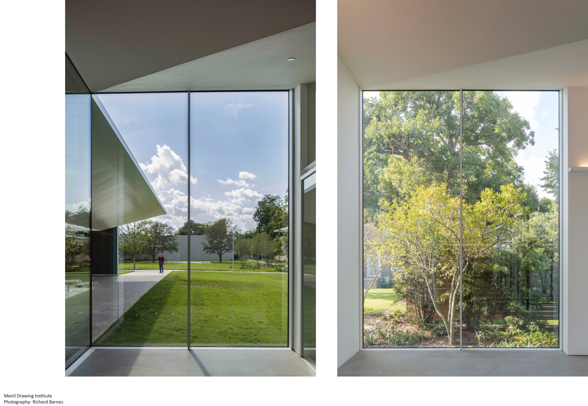
It’s hard not to think about it, but I think that's the pleasure of being an architect. I think in this particular case, our method of work was deeply invested in the history of the Menil Collection building and the legacy of the de Menils, but also driven by a very real set of demands for the technical conditions of the building which were unprecedented because there haven't been many buildings dedicated to drawing. The technical necessities of the project produced an overlay that changed the game a bit because, while the Menil campus is so well known for top-lit galleries, we couldn't do that. I think one thing that we're pleased with—in terms of an evolution from the legacy of these buildings—is that, much more like a house than an institution, most light, except for in the drawing room, enters the building as sidelight, which is more of a domestic atmosphere. If you are in a home you have light coming in from a window, and that gives a different kind of intimacy and connection to the outside that's not typical for museum buildings.
Lauren Phillips
So the technical parameters helped us forge ahead without getting too caught up in the history of the place. I think another thing that was important—and we worked closely with the landscape architect, Michael Van Valkenburgh Associates—was that as much as we were creating an interior environment, which was such a top priority, we were also thinking a lot about the space around the building. For the first time you see the south elevation of the Twombly Gallery. We thought through the scale of our building relative to that building. What does it mean to create this new scale of space on the campus? How does the courtyard relate to that new green south of Twombly? I think the urban conditions of the campus were very informative to our design development.
It has been a little over a year since the Drawing Institute opened. Have you gotten to experience many of the exhibits?
I was here at the opening, and I came back about a month or two later, and then this is the first time I've been back since. So, it's great to be here, and to see how the gallery evolves; it has such a different feeling with each show. We’re excited about the range of work that the exhibition gallery has had to support, and then to see the different wall drawings in the living room. One of the things that is so important about this building is that it's not just a museum, it's also a study center. It has a mandate to produce and broadcast scholarly research, and each kind of event brings the building to life in a different way.
I’d like to ask about your current commission for Philadelphia Contemporary, and how it relates to your work here at the Menil Collection.
While on the one hand, West Philadelphia is such a different context—it's much more urban – the two projects share a mission of engaging the public in a very non-didactic way which has been a part of the ethos of the Menil since the institution was founded. This was important to our design of this building—the generosity of the courtyards, the idea that you can come in, or just rest under the canopy and not enter. This idea of a cultural building being a host for urban life, or of thinking of the building like a kind of invitation, where people can decide how much they want to engage. Aspects of the institutional missions of the two museums are quite aligned, but the way Philadelphia Contemporary is trying to achieve that is through different kinds of partnerships. There will be a diverse mix of people working in the building, not just the museum administration, but in a shared co-working space. They are partnering with local schools to host education programs, and so some of the classes will happen in the building and others will happen in neighboring schools. We have several educational or artist engagement pavilions that will surround the building. One of them is a recording studio, and they will be able to host podcasts, and potentially have a local radio station broadcast from there.
There are a lot of interests that align with the Menil Collection—about being sensitive to this neighborhood you're situated in, and to have important international shows, but also local programs and civic activations. Local leaders are not only helping us think about the program but will be a part of the life of the building. There’s a parallel between the two institutions, in terms of a global/local philosophy of cultural engagement.
There are so many examples of architects who reach a certain level of success, and their work becomes stylized. Commissioning work from an established architect often carries with it a stylistic expectation. Johnston Marklee have been around for 21 years, and while your work seems to belong to a family in terms of visual style, you've been very careful about the projects you select—you seem to be committed to not becoming an aesthetic. When you’ve reached a certain level of visibility, how do you resist being codified into a certain aesthetic style?
I think, especially in journalistic situations, that there’s a tendency to put everyone in a box. And I think it's right that after having worked for a certain period of time, there are certain predilections or sensibilities that come forward. We're not necessarily fighting that, but we're trying to create a new context, a kind of blank canvas around each project that is as undetermined as possible. I don’t think you're going to hire us and feel like you're going to get a certain building that we've done before. There are certain sensibilities that track through all the work, but the part of our work—what gives meaning to our work—are all the particular circumstances of a project. Clients who want to work with us want to take that journey with us, and ultimately they'll get a project that's tailored to the circumstances of their project. That approach tracks through our work—even though sensitivity about light, and certain formal conditions carry through different projects. Sometimes you'll see a certain detail or figure reappear in a project, but with a shift in scale, or change in material. We have an interest in testing, and in changing circumstances to think about a problem in a different way, which helps us deepen our knowledge. Related to this research is our engagement with artists, engagement with people that are not typically part of our discipline, but nonetheless bring a level of inquiry and point of view that we value. Ultimately, a lot of the work is about finding a common ground, and then testing it by incorporating new input—whether it's other artistic viewpoints or different technical criteria.
To that point, both you and Mark [Lee] spend a lot of your time involved with architectural education. How conscious of a decision was it for you both to stay plugged into academia?
Right. I feel that in the discourse in the U.S., the kind of schism between academia and professional practice is strong. Early in his career, Mark spent a fair amount of time teaching and working in Switzerland, where the two realms are more closely aligned. We find the discourse in the academy to be important to us intellectually, but so is working on the Biennial, creating platforms for conversation that are about finding common ground and shared values. Mark's approach as the chair [of Harvard’s Department of Architecture] right now is about finding a way to support that discourse. We realize the power of industry in the U.S., and we've even found that sometimes our connections with the academy seem to hurt our chances for projects. People may think, “Oh, you're not going to have time for our work.” But for us, we have a long view of the profession generally, and of our careers, and we feel that fostering discourse across the two milieus of practice and the academy is essential to the advancement of the discipline. We feel it will better the work in this country by creating more overlap. We're not necessarily going to solve the problem, but we're going to try to lead in that way.
Could you talk about the collaborative culture of your office?
We’ve been practicing for 20 years, so that's a long time. Mark and I didn't come from big corporate offices. We didn't have a lot of professional experience, or a basis to say, this is how to start our office and how we're going to run it. We had a lot to learn when we started the firm. There have been a number of people—Anton Schneider, Nicholas Hofstede, Lindsay Erickson, Andri Luescher—who were key to this project. We've grown up together, and I think now we're understanding the need for more specific kinds of leaders in the office beyond me and Mark, and we're trying to arrange things so we can create more leadership roles in the office. We’re mindful of training younger architects. That takes a lot of work, too. Trying to do that with intention, to accelerate their learning process, is something we think a lot about.
Mark makes a wonderful statement in his conversation with Sarah Whiting [A House Is House Is A House Is A House Is A House, 2016] that, “As architects we have to be judgmental, in the sense that having a position toward one’s own work as well as others’ work is important. Being judgmental of other work helps us to articulate and sharpen our own values. And we try to be very specific with our judgments. At the same time, we are very private about the judgments we have established. To establish judgment is a deeply personal matter and not a means to attack or be critical of others.”
That’s why I think the Biennial, for example, was a chance to build something together, to create a platform for discussion, and look for things that connect us. Not to say, this is bad, or this is good. I think that architecture has become, like so many things in culture today, very polarizing. It can be very high and low. And these are binaries that we just don't find that interesting.
Perhaps architects are in a unique position to express their professional judgments by making something new, rather than merely criticizing. Do you have optimism about the state of architecture and the discourse, in this country in particular?
If you're not optimistic as an architect, you're done. So yes, I am. I feel that some of the challenges that hold young architects back in the U.S., like not having enough experience, or these sort of professional practice requirements, I think those are not going to go away. But I do think that younger architects are looking for ways to be entrepreneurial, and to find different kinds of contexts for design projects, and they are building robust careers from that exploration. Collaboration is maybe an overused word, but I do think that there's a lot of opportunity for big and small firms to come together.
We're part of a competition now with SOM and they brought us in for a certain level of expertise. As these big firms get bigger, they struggle to recreate the kind of practice sensibility of a small firm. I feel like that's a model that we certainly would like to support. We'd like to be able to either collaborate with younger architects or pass on projects that maybe aren't right for us anymore to others. This will build up the ecosystem. Everybody has to be generous, and that takes a commitment. Maybe school is part of that, or our focus on teaching is part of that. I think it keeps our connection with young and great future architects, and that's important.
Between your work in Marfa and the Menil Drawing Institute, you’ve done a fair amount of work now in Texas.
We’ve worked in two pretty rarefied places—Marfa and the Menil. Very modest projects, but both hallowed ground for art history and architecture. We’ve been really fortunate. I think what links those projects is an incredibly supportive cultural client community. And so, while this may not be the norm in Texas, I do think there are great philanthropic leaders in the state, and we feel that in both of those projects, we were treated like artists. We were respected. There was a real interest in going on a journey with us, and I think that makes a very different kind of architecture then a more conventional client, or more developer-oriented project.
Marfa in particular has a shortage of contractors who can construct to the quality your work demands. But do you find that there’s a process of educating your construction partners wherever you’re building?
It's tough. Frankly it's harder and harder everywhere. We try to stay close to the construction process, because for us, that's where meaning comes into our work. I won't say that it's easy to do that.
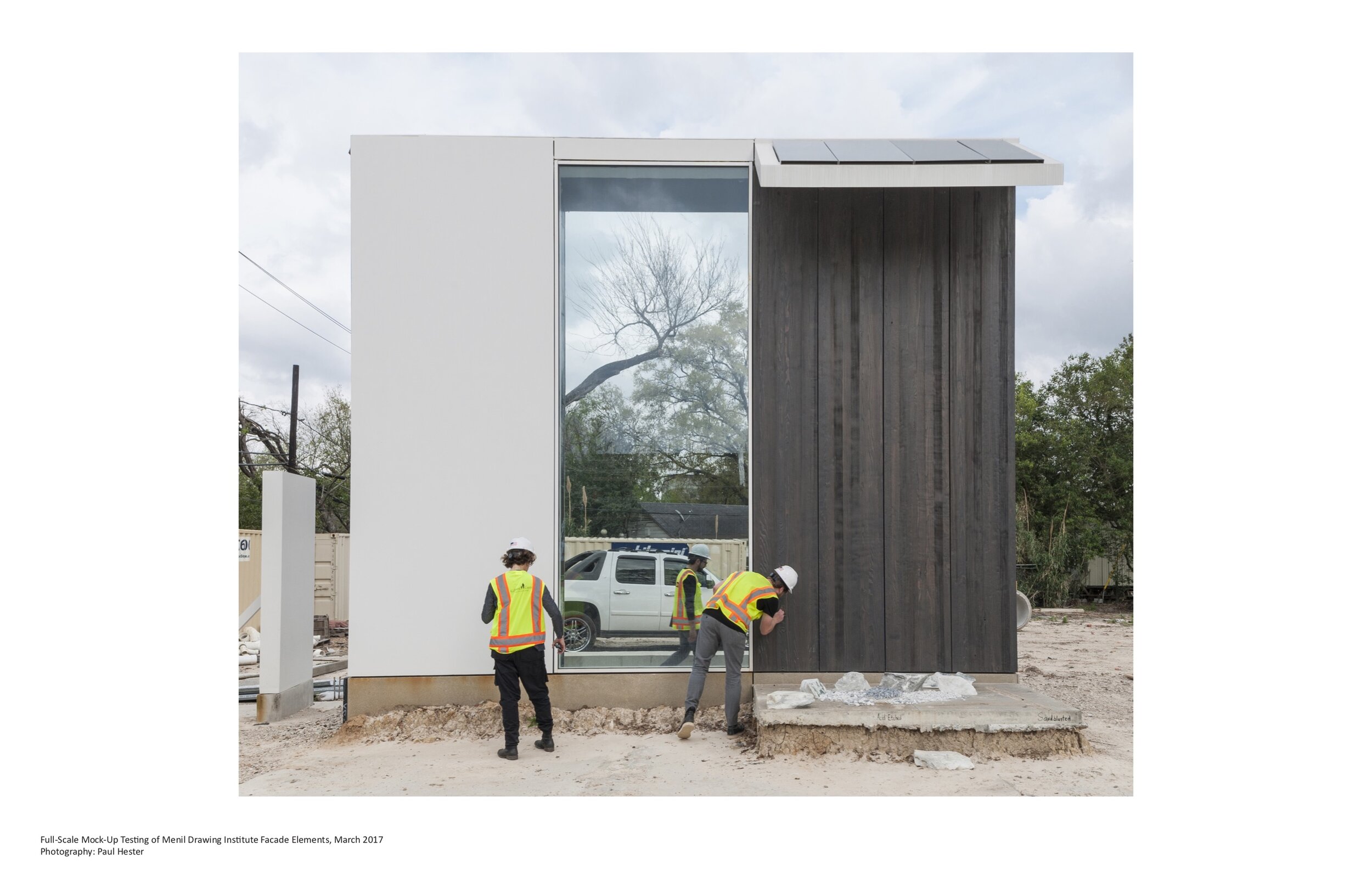
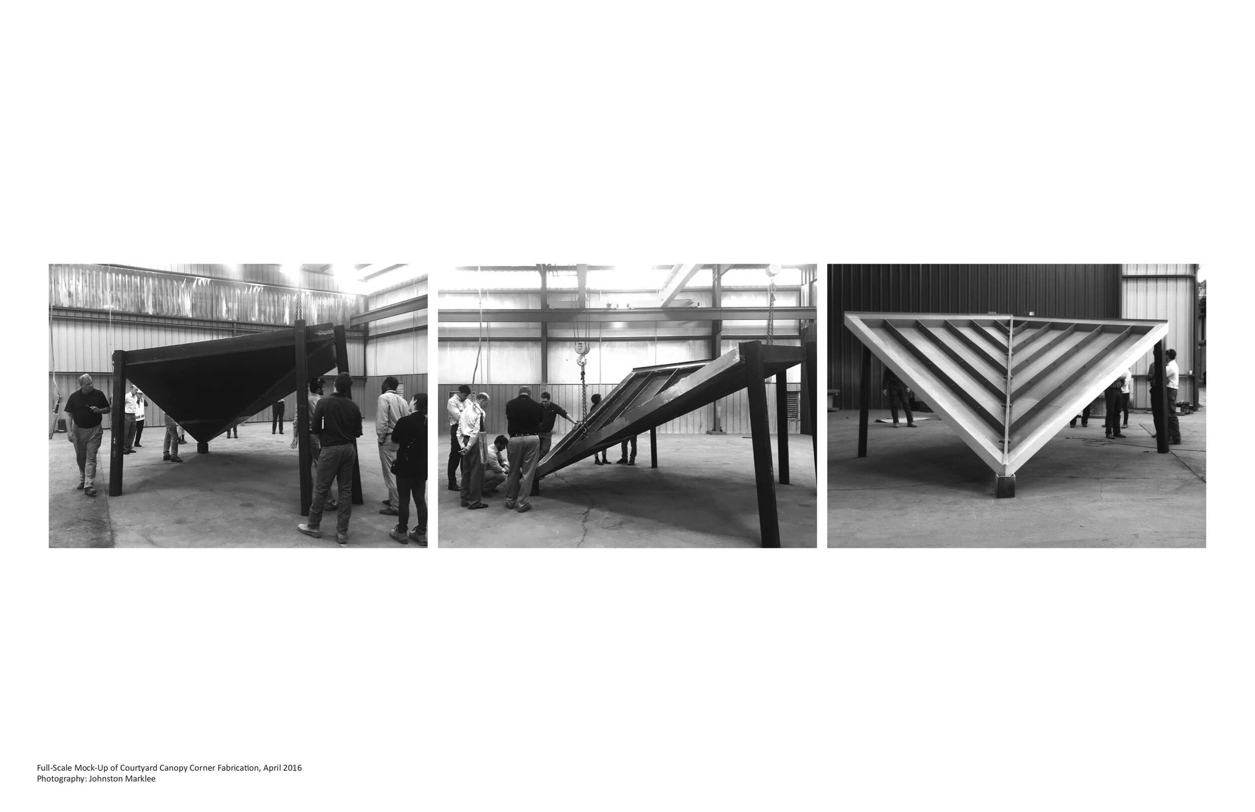
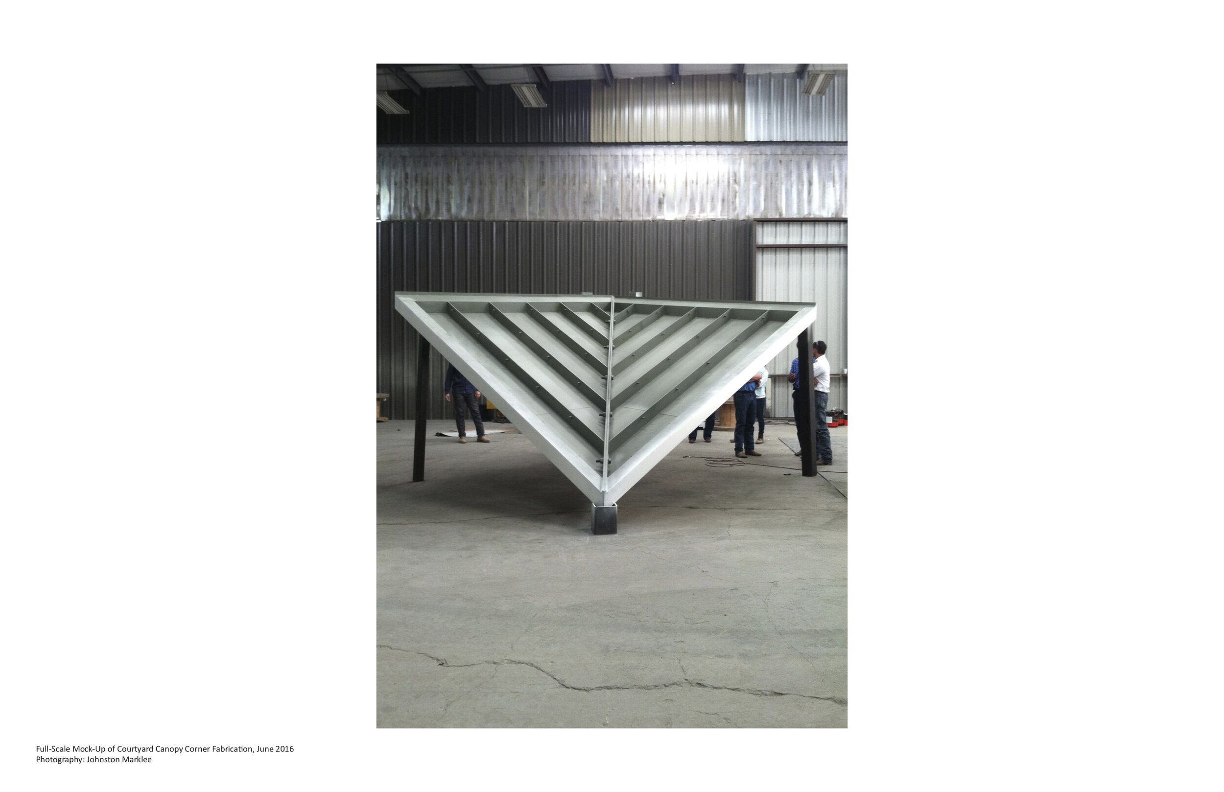
One thing that we do is incorporate a lot of mockups. We try to build as much of the building as we can and test it in a mockup situation. I think that's an important part of the process. You need a good builder to enforce quality. If you don't have that, then it's not going to measure up. Everyone has to be equally invested in quality building, and it’s important that architects are willing to roll up their sleeves and learn with fabricators. We're a firm where there's a certain expectation that we're going to be trying new things—and to do that, you have to experiment, you have to test things. I think that mentality puts an onus on everybody involved in a project to step up.
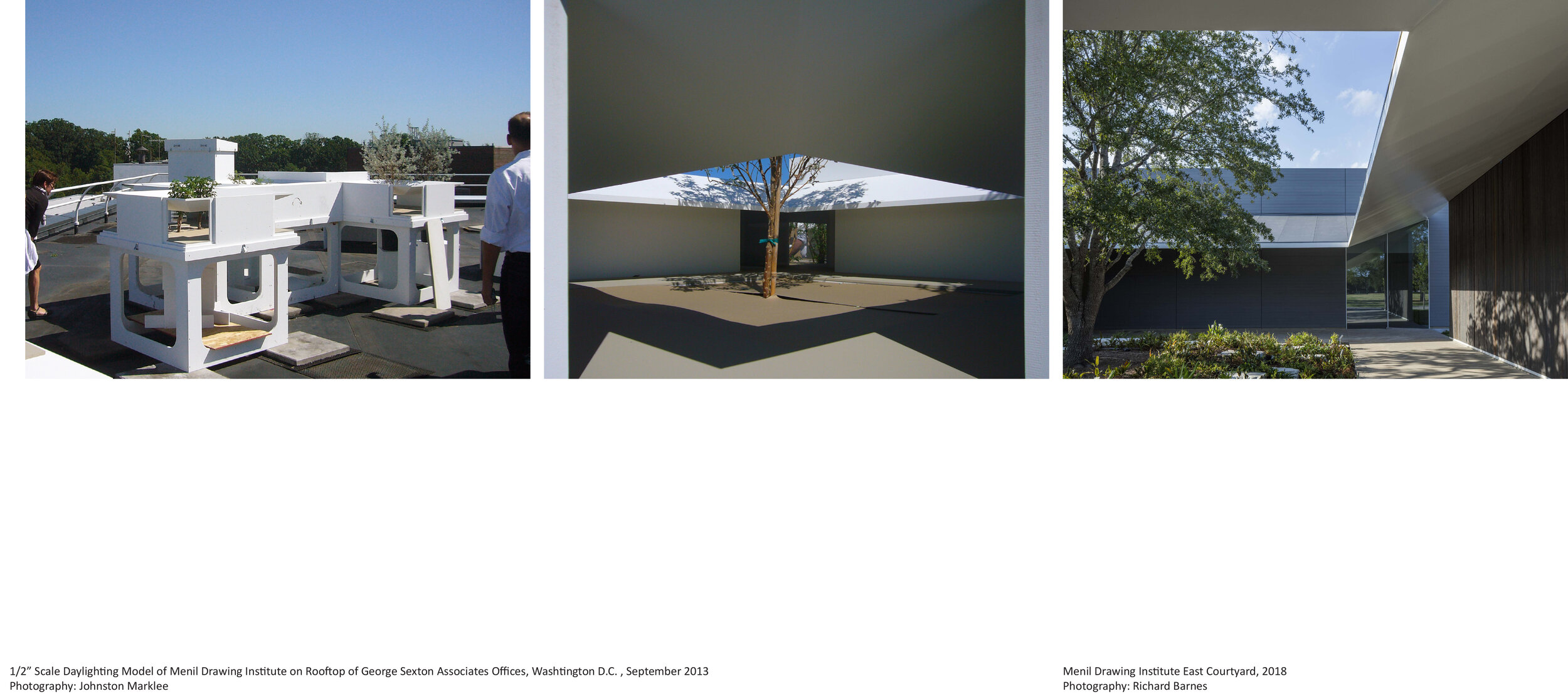
For the Drawing Institute, we did a lot of mockups. In terms of daylighting, our lighting designer, George Sexton, built big models and he had them on the rooftop of his studio in DC—oriented towards the lighting conditions here in Houston.
He took lighting readings for a year. The steel fabricators did mockups in their shop. We did mockups on site to look at joinery, joints, and waterproofing together with our structural engineer, Guy Nordenson. I think, for a certain kind of building and architect, embedding the mockup in the process, taking the time, and allocating the money for it, is becoming an essential tool to getting what everyone envisions as a finished product.
Is there anything that you find, when you visit The Menil Drawing Institute, that surprises and delights you in a way that you didn't anticipate?
I think what's exciting about it is that every time you move through the MDI—because of the levels of transparency, views, and because it’s so connected to the outside—it's always changing. That’s a quality we try to embed in our work. It’s what we call a kind of “dynamic equilibrium,” where at some moments it might feel very enclosed and others it feels radically open. I think the building possesses this quality.
When Josef Helfenstein hired us and was briefing us on the vision for the project, he said, “I want to be in the building and I, despite all the limitations and requirements, I still want to know when a cloud is passing overhead.” And I think that kind of openness to the environment is something that the building has, and it is kind of surprising. An unexpected view out a window draws the garden and light and shadow into the building, momentarily blurring the border between the interior and exterior.
Sharon Johnston, F.A.I.A., is a partner of Johnston Marklee & Associates, based in Los Angeles. Since its establishment in 1998, Johnston Marklee has been recognized nationally and internationally with over 30 major awards. A book on the work of the firm, entitled HOUSE IS A HOUSE IS A HOUSE IS A HOUSE IS A HOUSE, was published by Birkhauser in 2016. This followed a monograph on the firm’s work, published in 2014 by 2G.
Sharon is Professor in Practice at the Harvard Graduate School of Design; has taught at Princeton University and the University of California, Los Angeles; and has held the Cullinan Chair at Rice University and the Frank Gehry International Chair at the University of Toronto.
Projects undertaken by Johnston Marklee are diverse in scale and type, spanning seven countries throughout North and South America, Europe, and Asia. Recent projects include the Menil Drawing Institute, on the campus of the Menil Collection, which opened in November 2018; a renovation of the Museum of Contemporary Art Chicago, completed in September 2017; the new UCLA Graduate Art Studios campus in Culver City, California; and the design of the new Dropbox global headquarters in San Francisco, California.
The firm’s work is in the permanent collections of the Museum of Modern Art in New York, the Art Institute of Chicago, the Menil Collection, the San Francisco Museum of Modern Art, the Carnegie Museum of Art, and the Architecture Museum of TU Munich.
Together with partner Mark Lee, Sharon was the Artistic Director of the 2017 Chicago Architecture Biennial.


