In Conversation with Mark Wamble
Courtesy of Architectural Safety Components (ASC)
This conversation was originally recorded for the Rice Architecture podcast, Tête-à- Tête.
Lindsey Chambers: As part of Interloop Architecture's work as associate architect on the Renzo Piano-designed Nasher Sculpture Center you designed and fabricated a custom exit sign for the galleries in 2002. Can you tell us the story behind this first exit sign?
Mark Wamble: In 2001, my partner Dawn Finley—that's my partner in Interloop-Architecture—we were both teaching at Rice and working in separate architecture offices. Dawn was working for HOK as a project designer, and I was working as a partner with Will Cannady at Bricker and Cannady Architects. We decided in 2001 that we would form our own office. We had co-authored projects prior to that; we’d written articles together and had our work exhibited at museums around the country, and we had built a handful of small projects, but we felt like it was a good time to make our move and to start Interloop-Architecture. In 2001, we resigned from our respective offices and we incorporated Interloop Architecture.
We were having lunch with a former student from the Rice School of Architecture, Brett Terpeluk, while he was one of the designers with Renzo Piano's office in Genoa (RPBW.) And at some point he said they were looking for someone who could help them administer the design for the Nasher Sculpture Center in Dallas. They were just excavating the site at this point. They hadn't really started construction, and there was a lot of work left to do on the construction documents. So Dawn and I just thought, okay, yeah, we'll think about that and see if we can recommend someone. We finished lunch, and at some point Brett went outside to make a phone call. Dawn and I just looked at each other and thought, you know, we have no work. We need that job.
Brett came back in, and we told him that we might be interested in interviewing for the job. And he said, great. We met with Renzo, we met with the design partner Emanuela Baglietto, and we met with Ray Nasher, and they thought we were perfect for the job. We started working right away.
Originally, we were hired directly, as a consultant to Renzo Piano's office, so it was Dawn and I, and we had one part-time employee. Our responsibility was to administer the RPBW design. Usually someone who's hired to administer construction, does construction administration work within an architecture office. But we were hired to administer the design. We traveled every week for three years. I think I took 180 flights back and forth to Dallas. Our initial responsibility was to finish portions of the construction drawings, and to ensure that things were being implemented in the way that Renzo and his office expected them to be implemented. If there was a conflict, we were asked to resolve it onsite, if we felt we could. If we didn't feel comfortable making certain decisions, we would contact Renzo’s office in Genoa, and we would get a resolution quickly. Over the first few months on the job site, the Nasher Foundation became very comfortable with us. So, we extended our contract with Renzo’s office, and then the Nasher Foundation extended our contract again, but with them directly, and on several occasions, separately.
We were asked to coordinate the design between Renzo’s office and the landscape architects, Walker Associates. We were asked to resolve the technical design of the auditorium downstairs. We were asked to co-design the miscellaneous metal work, the loose furniture, the bookstore, the cafe. Eventually we were asked to work with a graphic design firm to help implement the signage on the project, including their concept for a neon exit sign.
For background, anytime you're working with an emergency exit sign or any kind of life safety product, you have to submit your design to Underwriter Laboratories (UL) for approval. Municipalities around the country rely upon UL to guide and test the development of consumer products, including life-safety equipment. And UL has very strict design guidelines for exit signs. We were asked to review those guidelines and to assess the design submitted by the graphic design firm based upon those guidelines. We found out very quickly that, because neon is a high voltage light source, it buzzes. We didn't think that was going to be particularly good. And the neon exit sign was to be hung from a glass ceiling, which was difficult, if not impossible to accommodate. Most importantly, the legibility of neon was an issue as the stroke for each letter was hard to control. We had conversations about this with the graphic designers, and we made proposals for alternate light sources and alternate ways to achieve a custom design. Eventually, based upon our comprehension of the technical and aesthetic nature of the task, the Nasher Foundation asked us to take over.
At the same time, the Nasher Foundation had hired us to work with James Turrell on Tending, (blue), the Skyspace they had acquired for the garden. With Tending, (blue) Turrell wanted to use a fairly advanced LED technology in conjunction with what he always uses, which is cold cathode lighting. We became very familiar with LED technology—who manufactures it, what its color and brightness capabilities are, what its light sources are like, what the power sources are, how you wire the fixtures to achieve a desired effect, and how you dim everything. In short, we were asked to figure things out technically, and make sure Turrell’s final design could be implemented. Eventually the Nasher asked us to take over the exit sign project, in part because of the knowledge we had developed for Tending, (blue). We worked to resolve a new exit sign design featuring compact LEDs and custom circuitry, and then we actually manufactured the exit signs ourselves. We manufactured 45 exit signs on our dining room table because we couldn't find anyone else who could do it.
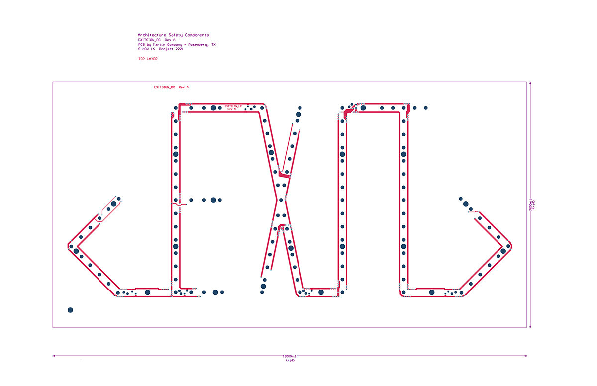
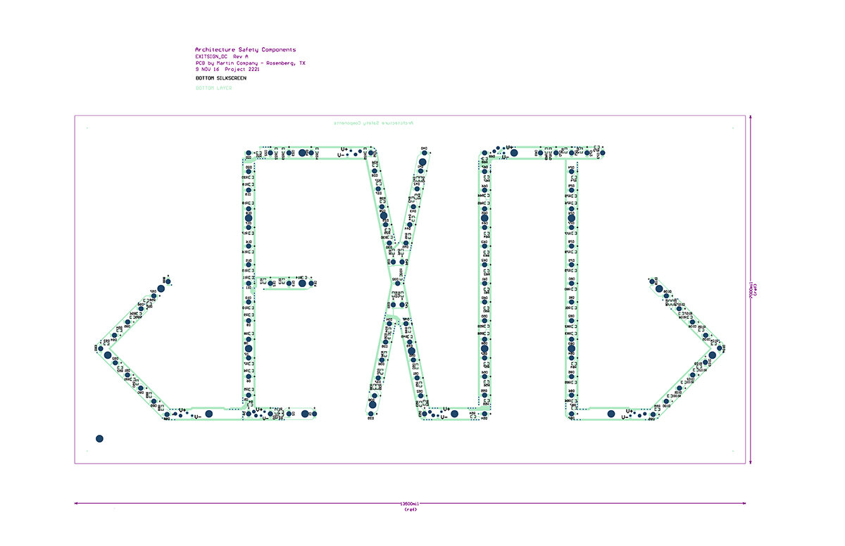
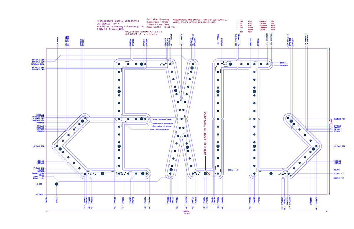
They were installed at the Nasher in 2003. One of the many takeaways for us was that if you understand the design constraints, and if you have a good grasp of the technical aspects, you can innovate at a deep level, in spite of the strict guidelines imposed by Underwriter Laboratories in this case. If you can do that, you can pretty much design anything.
The Nasher exit sign is a one-off object for a very specific context. This is inherently different than creating a project or a product that's intended to be available to a wider audience. How did you take the technical knowledge that you learned in designing the Nasher sign and then develop it into what became Architectural Safety Components?
For the Nasher, just about everything was custom. The same was true for the exit signs. We did seek and receive UL approval for the design, and it was implemented with a UL file number, which is a lot of technical information. But it was designed for a one-off application, based upon how visible and how recognizable the sign was in the Nasher Sculpture Center context. What UL calls the “legend” (the letters E-X-I-T), which for Nasher was a very faint green line floating in a thick white lens, maintained enough contrast with the stone and other materials that were in the museum so that the UL inspectors deemed it acceptable in that one application. If it were to be used in another building, there was really no guarantee that it would be legible by UL standards.
After the signs were installed, the Nasher opened, and the ceremony was attended by a huge gathering of artists, collectors, curators and architects. There were hundreds of people who walked through the museum that first day. At the end of the day, the Museum Director, Steve Nash, came up to me and he said (with a smile), “You know, the Nasher Foundation maintains a priceless collection of sculpture. Throughout the day, people would look around the room at the collection, and then they would look up at the exit sign, and they would point to it, and they would ask, where did you get that exit sign? It was a recurring question put to me throughout the day.” As a result of that, and as a result of it being such a high-profile building with so many visitors, other architects pursued us, asking for the same exit sign. We had inquiries from SANAA, Norman Foster’s office, and Steven Holl’s office, to name a few. We had all these high-profile architects inquiring about the exit sign, but we had to turn them down because the exit sign design for the Nasher was not our intellectual property. It belonged to The Nasher Foundation. We couldn't use it, we couldn't reproduce it, and we didn't feel like it was appropriate to even entertain the idea. This was a recurring theme from 2003 till 2009.
If you recall, in 2009 the financial market collapsed. Our office was going full steam, we had multiple employees. We had a lot going on. And then many of the projects that we were working on either had their budget slashed or were shelved altogether. We were confronted with the possibility of laying everyone off. We had some people in the office who were continuing to work on projects that were under construction at the time, but they weren't being fully utilized. So, we decided at that point to pursue another exit sign design using the expertise we had gathered from the Nasher. We had a good group of designers in the office, and they had time to direct their energies toward another kind of project.
But this time we started from UL 924, which is the design guideline that all exit signs have to conform to. We went through the guidelines in detail. We met with our engineers and manufacturers and we put together a series of prototypes that we thought were interesting.
At the same time, Dawn and I brought in a partner, Sam Youdal, who is an old friend and who comes from a consulting background. Sam brought with him associations with banks and attorneys and accountants who could help us set up our company. So as we pursued the design of the new exit sign, Sam helped us figure out how we would put together a company that was based upon manufacturing and the sale of products, as opposed to a company like Interloop-Architecture that was based upon delivering design solutions for one-off buildings. Bringing Sam in was an eye-opener, and an education for Dawn and me.
The adjustment we had to make was how to address the question of the design of a product that is going to go to many places that we have very little control over. When that product goes out there, who has access to it and what they do with it is out of our hands. It has to perform, as designed, under circumstances we may never come to know.
In this case, we had a design we wanted to pursue, but started from the UL design guidelines, looked at them very carefully and then figured out what the design solution could be in response to that.
LELU UL Samples, courtesy of ASC
In looking at UL from the beginning of the process, how many iterations of the sign did you go through before you landed on one that you were able to manufacture and continually produce?
We probably went through a couple different prototypes that had slightly different configurations for how the sign was mounted, or how the letters were detailed, or how the lenses snapped onto a back plate. I would say that we went through two or three variations at first, but they weren't that different from one another. One thing that did evolve, which was a consequence of having availability to our attorneys, was our understanding of Intellectual property. Each time we produced relevant prototypes, we submitted them to the patent and trade office. Having patents, even patents that are pending, insured a duration of time that our designs could not be copied, and with that a market shelf-life for our design that could be preserved. We have three design patents, and two utility patents, as well as several trademarks and copyrights for our product.
But the process of going through the patent and trade office is one where you submit an application, and you submit photographs and drawings of the prototypes. Along with that you are required to submit your knowledge of any other product that is remotely similar to the design you are submitting. This is a legal obligation on the part of the applicant. You have to submit those related products so that the patent and trade office can assess whether your design is distinct enough to merit its own patent.
So, as you might guess, we submitted our drawings for the exit sign we produced for the Nasher Sculpture Center. We submitted our new prototypes and gave them clear documentation of both signs. Then we submitted the standard edge-lit sign.
They looked at the Nasher sign and said, no, your sign is significantly different from this sign, which allowed us to proceed with the patent application. It was significantly different from a design point of view, as well as from a technical point of view, which relates to the way light passes from the LED on the inside the sign, to the face of the lens at the outside.
One of the more instrumental innovations, which is one of the things that we earned a utility patent for, had to do with our understanding of the optics of light and how it contacts the inside surface of the lens. It travels through that lens in a prismatic fashion, and then ends up on the surface of the lens with complete uniformity, which is something UL requires on all listed exit signs. Since our design required that each letter in the E-X-I-T legend have its own lens, achieving uniform light across one lens face, and then across each lens face uniformly, was essential. This is the feature for which we were awarded a patent.
So, we went through the patent and trade office, having refined those details and making sure that they were something that could be protected, we went back and made sure that they performed for UL as well. And we made sure that they were something that we could manufacture in an affordable way.
That was probably the most difficult, but the most rewarding aspect of the design: we got pushback from UL, got pushback from the patent and trade office, and got pushback from our local manufacturers, so that we could refine our exit sign design and make it better. All the prototypes were based on this kind of back and forth.
There are two signs right now. One is molded plastic and the other is milled aluminum, but are there other differences?
As far as electronics are concerned, they are the same. The electronics have evolved quite a bit since we started manufacturing the sign. We've been able to reduce the amount of energy consumption to about four watts. Energy Star ratings require you to consume no more than five watts and we were able to get it to four watts. LELU, which is what we call the milled aluminum sign, uses a slightly different configuration where the sign can be mounted with a very small round escutcheon to a wall or in a ceiling. It’s super minimal in terms of its aesthetic. The detail for how it's mounted is a bit nicer, but everything else about the electronics are the same for both LELU as well as ELIS, which is the injection molded sign. The difference with ELIS is that we really wanted to find a way for customers whose projects are driven more by economics to be able to include our signs in their projects.
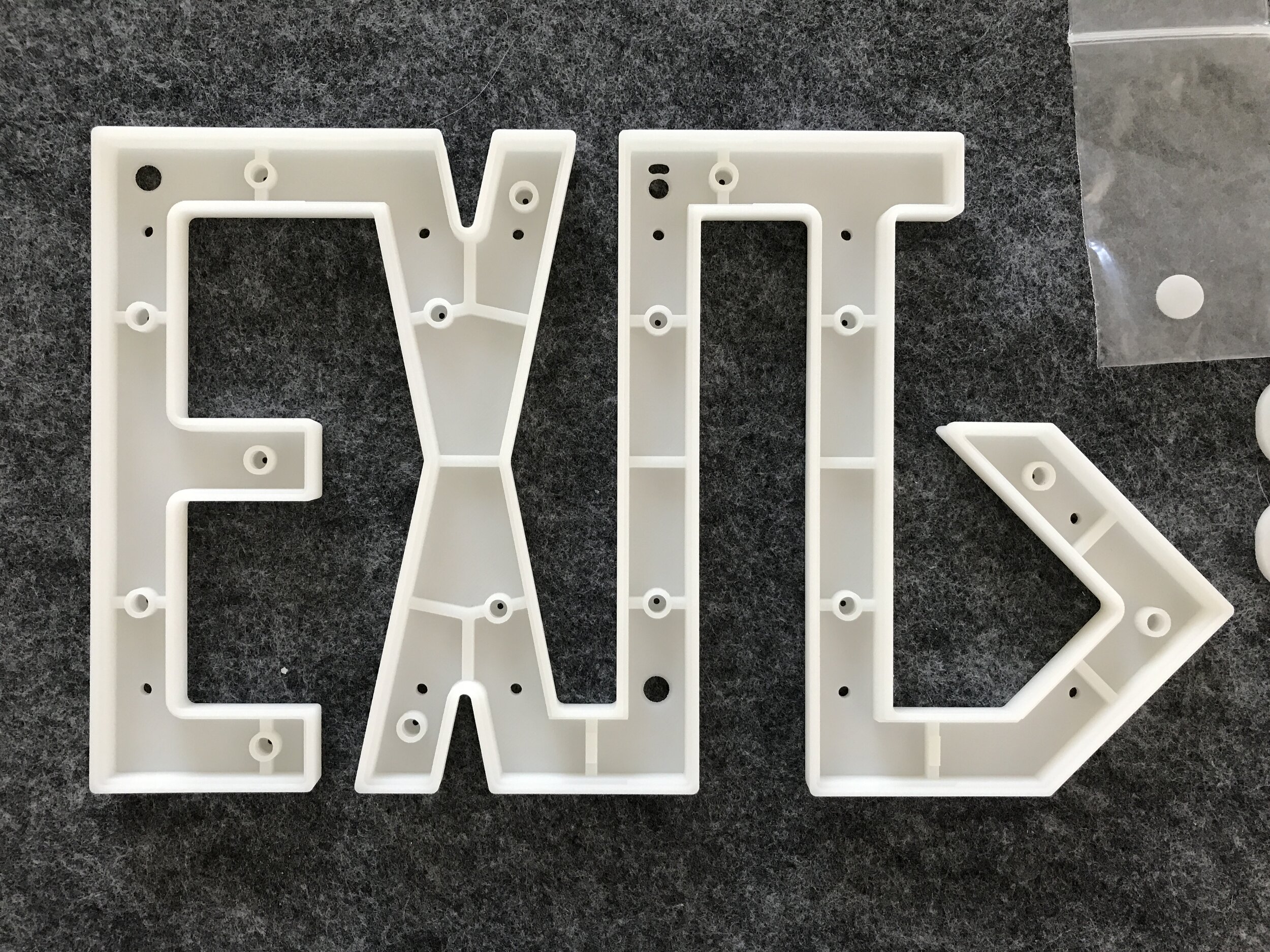
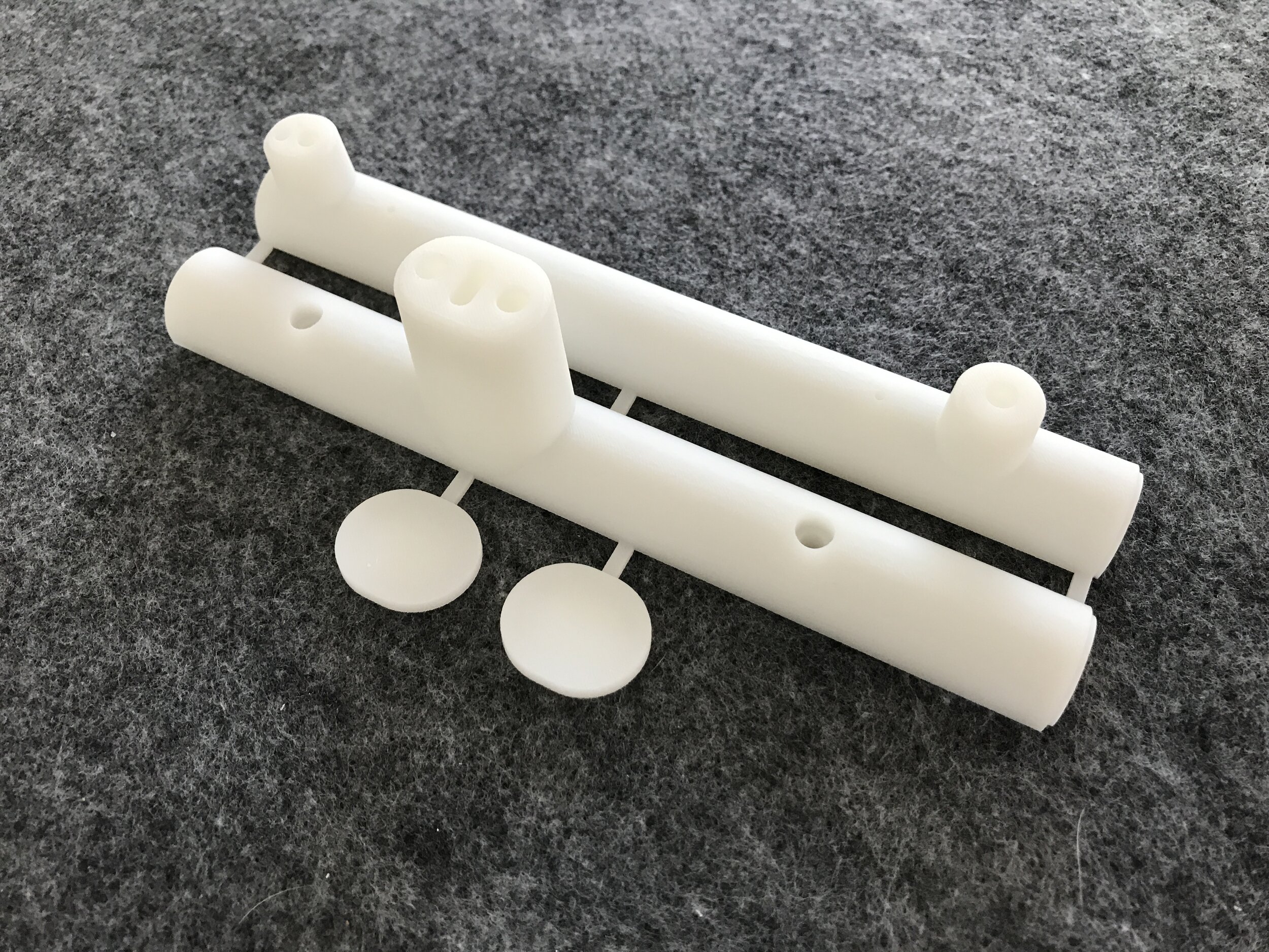
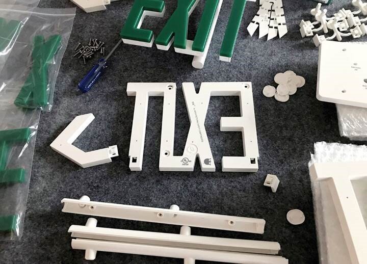
ELIS costs about half the price of LELU, and it's modular. A lot of the parts snap together. We can configure different mounting details, as well as different face configurations with a chevron to the right or the left, or two chevrons or no chevrons, just by snapping parts in and out. The injection-molded part is meant to be simple to put it together, easy to stock large quantities of parts, and fairly quick to put together and ship. We wanted it to be more of a volume market product than LELU, which is made-to-order.
LELU outgoing order, courtesy of ASC
Do you see ASC having any plans for other signs that might meet those affordability and sustainability ideas while still achieving a high design aesthetic?
We've talked about several other options, and from the beginning we wanted to not only address exit signs, but all the life-safety fixtures in a building. Whether that was strobes or alarms, or pull stations, or any of the other components that are required by the Fire Marshal and just part of the overall life-safety package, but are generally considered unattractive (by most architects) when you see them on the wall. That is something we're still very interested in doing. But because so much of our expertise is in the production of exit signs, knowing everything about the UL design standards, knowing about luminance, and how the signs are tested and have to perform, it makes sense for us to come up with other designs. We have probably two other designs in folders sitting somewhere in our office.
And if we decide that the time is right for doing that, we'll implement those. I think the criteria will be that it's simpler and quicker to manage manufacturing. Because LELU is made-to-order, and because of the number of design choices we offer, there are over 600 variations possible. If you go to our website, you can build any number of configurations. It’s a massive set of possibilities for how to configure the exit signs for a project. We just shipped ninety-five signs to the Academy of Motion Pictures in LA over the summer, and roughly eighty to eighty-five of them were custom, using slightly different shades of white, or shades of black, or mounting details. When you produce signs like that every one of them requires a high level of hands-on managing of the process. We’re very careful about how we put things together, and every exit sign has to be inspected by a UL inspector. There is a lot that goes into the way that the signs are ordered, assembled, shipped and installed. We'd like to have something that would be simpler for people who just want a higher level of design for those pieces of emergency equipment.
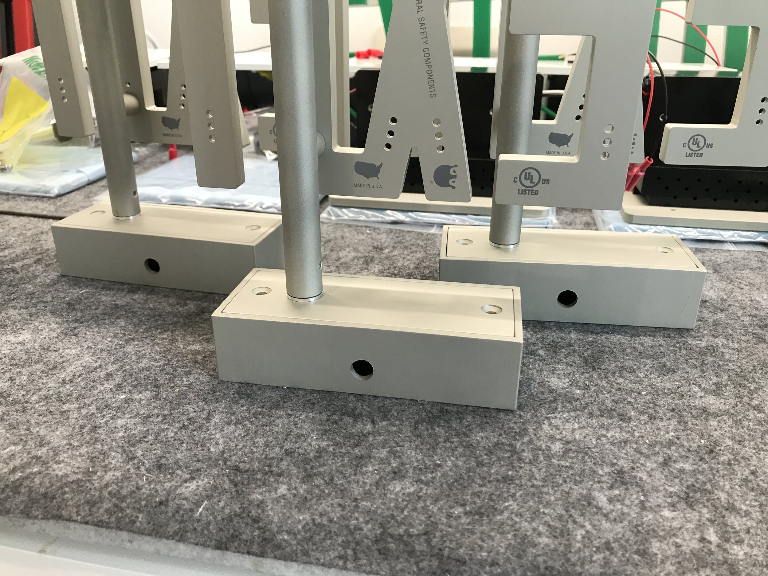
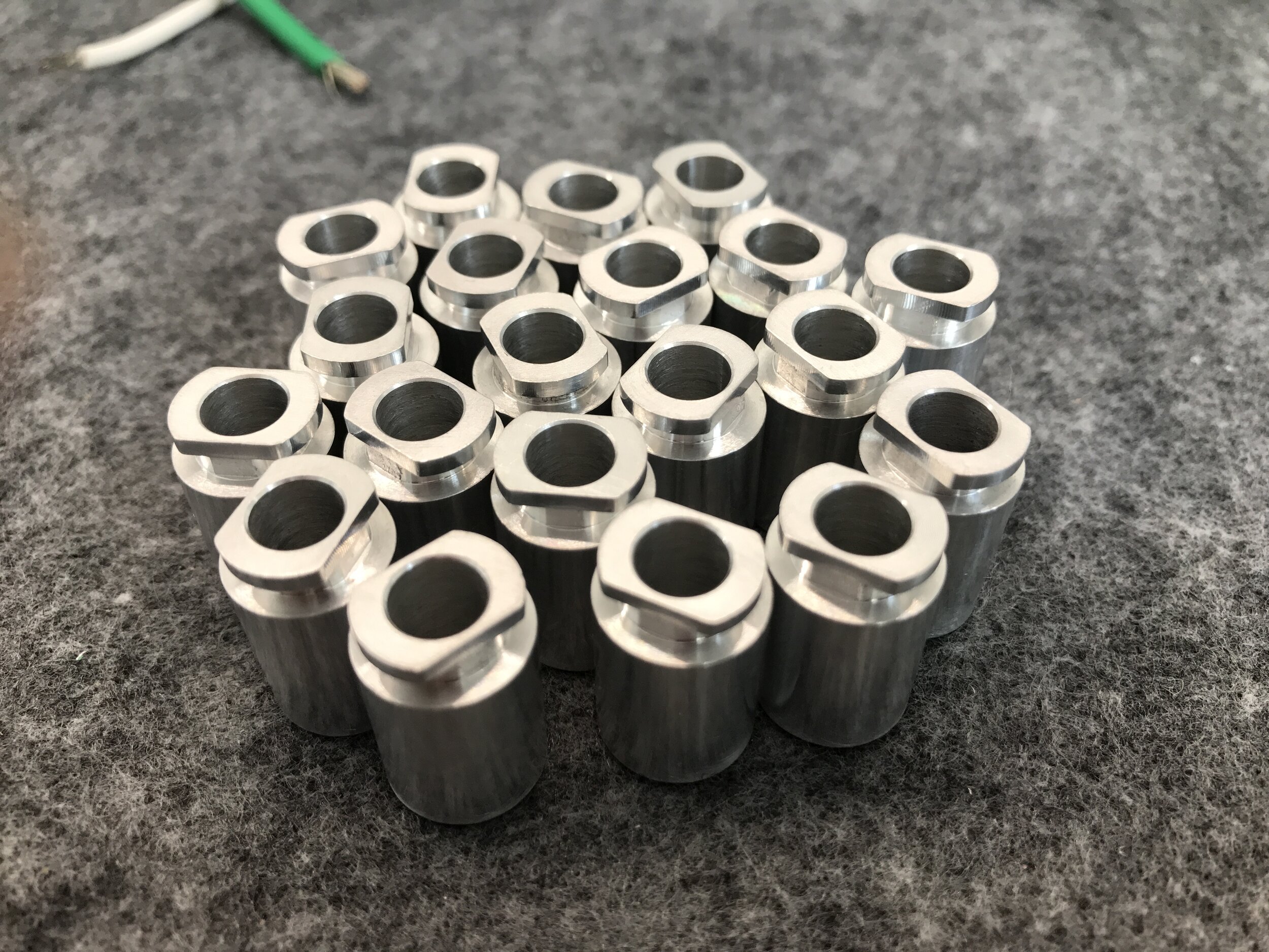
You talked about how you would want to branch into other life-safety fixtures, because they are objects that we tend not to think of as being designed. How has designing such a ubiquitous object made you think differently about design?
It would be interesting to compare the design process of a life-safety fixture that is intended for mass production, with the design of a building, or something that you would normally find in an architect's office. I think you would very quickly differentiate between the way that you lay out the problem for a life safety fixture and the way that you lay out the problem for the design of a space. With life-safety fixtures there are criteria that are very clearly spelled-out, so it's impossible to ignore the fact that, at some point, someone's going to scrutinize every detail of that product with conformance in mind.
And rightfully so, if it's a life-safety fixture. Whereas with the design work that we pursue at Interloop-Architecture, there's a high level of inefficiency in the process, but it's for a good reason. We stumble upon all kinds of details, directions, and other possibilities that can sometimes lead us in a new direction, knowing the freedom to take that new direction also comes with the obligation to restate the nature of the problem for the client. In architecture we call this thinking outside the box. With manufactured products—especially those pertaining to life-safety—it’s called breaking the rules, and you’re not allowed to do it. With architecture, if it's a direction that we think is wise and that our client thinks is wise, then we follow where the design process takes us.
With LELU we were able to push the boundaries with UL and ask them to approve something that they'd never seen before. For example, with the initial testing at UL for LELU, there were a whole series of tests. As soon as they saw our prototypes, they started to scratch their heads and think, okay, how do we even begin to test this? Most exit signs have a molded box, and the box is where the light source is. And then there are letters cut out of that box. And that's how you illuminate the letters, with two or three LEDs inside of a box. And it works just fine.
LELU outgoing order, courtesy of ASC
With our exit sign the letters are individuated and discreet. They are profiles; they have no larger armature. So when the samples arrived at UL, they said, okay well we just want to let you know that we're going to have to throw every test that we have at this because we've never seen anything like it. And they said, this is how much it's going to cost to complete the tests—let us know if you want us to proceed. So we, of course, looked at that and thought, well we're dead. There's no way it's going to be able to pass all these tests. We thought maybe we should just pay them to perform the first, least likely test that we could pass, and if we pass that one, we will pay for the other ones as well.
That test was called the non-energized contrast visibility test. In this test UL engineers take a proposed exit sign design and they place it in a long narrow room that is 100 feet in length. The floor, walls and ceiling are painted black, and as the name of the test implies the exit signs are unplugged. And—this is all taking place in San Jose, California—they go out on the street and find six people who have a current California driver's license, and they bring them into that room. They take one of our signs, and they put it at the end of this long, dark room. They take another one of our exit signs, and they cut off the lower stroke of the “E,” so that it turns into an “F” And they cut off the lower stroke of the “X,” so that it turns into a “Y,” and they set it right next to one that’s intact and unchanged. They dim the lights to 30 foot-candles, which is about what you would see in a typical residential kitchen.
So, it's a long, a dark corridor. The exit signs are unplugged, and are one hundred feet away. There's a stripe on the floor that you cannot cross, and someone with the current California driver's license—and maybe they pay this person a modest participation fee and they say, okay, you have 10 seconds to tell us which one says “exit.” This test is performed with six different individuals, and I think it was with four or six different permutations of the exit sign. In order to pass the non-energized contrast variability test 80% of the participant responses have to be correct. And somehow initial samples passed with a 100% success rate, which was a surprise to us because we thought if there's one way that it would fail it would be because the letters were not legible without the integral background of a box. So that was probably the strictest test, but it was also a confirmation that the design was working and that it was worth pursuing. And as a result, we followed through with the rest of the testing and passed each one with few adjustments to the design.
What advice would you give to students or practicing architects who might be interested in pursuing design interests outside the traditional scope of architectural practice?
Architects pride themselves on being generalists. What we find over and over again is that when you're given a problem there's an expectation that you're going to produce some research to figure out the best way to solve it. As generalists, we're used to the idea of taking on different types of design problems, researching them, looking at them with a very wide lens, and then narrowing it down to specific solutions.
What happened with the exit sign project, and also with the exit sign at the Nasher, both of those are examples of someone coming to us and throwing out an idea that was not really what we were expecting. At the time we were asked to interview for the Nasher, we weren't really interested in being hired as technical architects. But we knew we had to make good use of our technical training—every architect does. At that time, we didn't really see ourselves as technical support architects.
What turned into a whole series of small design projects for the Nasher Foundation, at first just seemed like a series of technical exercises. We took the job for what I think are very good reasons. One was that we had a new office that had no work. But the other was that there was an interesting client, someone that has a long and rich history in Dallas, which is the Nasher family. We were asked to work with Renzo Piano's office. We travelled to Genoa and spent time in their office, and with them when they traveled to Dallas. It was interesting because the architects and the design team were so accomplished. Working with quality designers is always a great experience. And then when the economy forced us to think differently about the way that we conducted our practice and what we did with our staff, we realized it was an opportunity.
Even though the opportunity may not fit the profile of the opportunities you thought you were looking for it's worth the experiment, because that experiment will often yield experiences that are useful and applicable in many ways that you can't anticipate. And if the criteria include working with interesting people or on projects that will expand your repertoire, then I think that's the path to follow. It’s fine as a student to have an ideal practice in mind, and I think you have to hold onto that and use it as a benchmark. But I believe that, at the same time so many of the opportunities that we've had at Interloop-Architecture, as well as at Architectural Safety Components, have come from people tossing ideas our way and saying, “Is this something you can do?”
Mark Wamble is a founding principal of Interloop—Architecture and has more than thirty–five years of experience in architectural practice. He is a founding partner of Architectural Safety Components, a manufacturer of made-to-order exit signs and other emergency fixtures. Wamble is a Professor of the Practice at the School of Architecture at Rice University where he has taught since 1990. Wamble received a Bachelor of Environmental Design from Texas A&M University and a Master of Architecture from the Graduate School of Design at Harvard University.
Prior to establishing Interloop—Architecture, Mark Wamble worked as a Project Designer, and later as Project Architect, with Eisenman Architects in New York (1983-1990) where he was on the design team for the Wexner Center for the Visual Arts at Ohio State University in Columbus, Ohio. Wamble was also Project Architect on the Columbus Convention Center in Columbus, Ohio, and on three office buildings in Tokyo, Japan. With his team at Eisenman Architects, he designed the winning scheme for the international Rebstockpark Competition in Frankfort, Germany. In the early 1990s, Wamble was selected for 40 Under 40, a prestigious award given to emerging young architects in the United States. Later that year, he won the Young Architect Award from the Architecture League of New York.
In 1994 Wamble began Interloop A/D, and later in 2001 partnered with Dawn Finley to form Interloop-Architecture. His research and design work with Dawn Finley includes: Symonds 1 and Symonds 2, a pair of advanced interactive learning environments for Rice University, Klip House, a service based housing platform developed for mass production, Plug-On, the first in a series of residential product prototypes, 1AB Stim, a site specific interactive installation for the First Architecture Biennale in Rotterdam, Tending(Blue), a new building in collaboration with artist James Turrell, commissioned by the Nasher Foundation in Dallas, Texas, 9° House, a private residence and addition to an historic house in Houston, Texas, Yoga Studio, a private yoga practice space, garden and guest house in Houston, Texas, and HHMI Janelia Farm Housing, a 60-unit housing project for the Howard Hughes Medical Institute in Ashburn, Virginia, to name a few. In 2001 Interloop-Architecture was commissioned by Renzo Piano Building Workshop, Genoa, to be their Associate Architects for the Nasher Sculpture Center in Dallas, Texas. Also in 2001 Interloop-Architecture designed an exhibit of their work for the Aluminum in Contemporary Architecture exhibition at the Carnegie Museum of Art in Pittsburgh, Pennsylvania.
In 2011 Wamble founded Architectural Safety Components (ASC) with long-time friend Sam Youdal, to pursue a manufacturing business focused on life-safety and emergency equipment for public buildings. ASC has provided custom and made-to-order exit signs to over 90 construction projects across the country, including Knoll Showrooms, Blue Bottle Coffee, the Space Needle in Seattle, T-Mobile outlets, Abercrombie and Fitch locations, a wide range of retail, office and showroom locations, the Alliance Theatre in Atlanta, Georgia, and the Academy of Motion Pictures Museum and Theater project soon to open in Los Angeles, California. Wamble holds five design and utility patents for products he designed for Architectural Safety Components.
Wamble has served as a visiting professor at the University of Michigan, Harvard University, and Columbia University. Mark has lectured extensively at prestigious institutions such as Harvard University, Yale University, Columbia University, University of Michigan, The University of Texas, UCLA, Ohio State University, The Nasher Sculpture Center in Dallas, Texas and the Museum of Modern Art in New York City.
